Team: Fei Gao
Tools: pencil, paper, mobile phone, construction paper, cardboard, tape, scissors, rulers, Sketch, Omnigraffle
Topic: Embodied Interaction
Final: Escalator Research Final Report
Overview
You must have ecountered this situation:
You are strolling in a shopping mall, with or without friends, you look around the environment, there are all kinds of shirts, shoes, perfume in the shops.
Look at that suitcase, aren't you going on a business travel in two days? That suitcase really fit your situation. Oh, what a decent tie, why not take it for
your friend's party?
Then you arrive at the escalator, suddenly all these great shopping moods are gone because you find there's something wrong with the escalator, you are supposed
to go to the upper level, but the escalator takes you to the lower one. You stop thinking about all the great things you've seen, instead you try to find out where
is the escalator taking you to your destination.
Everyday, shopping malls receive tons of customers. And everyday, tons of customers will have such experience. But ask yourself, what is actually wrong in this situation?
Is it because of the design of the escalator? Or is it because you're too immersed in the environment that you don't even pay attention? Whatever the reason is, I was very
interested in the reason behind this phenomenon, so in this class project I did a personal research to explore the cause.
Three Rounds of Observations
I performed three rounds of observations, all of which took place in Water Tower Place, which is modern shopping mall which 8 floors in total.
First Observation
The first observation took place in the afternoon at a weekend, the traffic in the shopping mall at this time is heavy enough for me to observe and identify some general problems,
such as how frequently this phenomenon occurs, what would be the reasons for it, etc.
After this observation, I tried to explain the reason why people make mistakes in judging escalators' directions in a rational way, which will be explained below.
Second Observation
The second observation also took place in a weekend afternoon, this time I mainly did thick observations, I watched (and even followed) the whole process of people using the escalators, from strolling the mall, looking for escalators and finally reach their destination floor.
Through thick observation, I summarized two kinds of customers in the shopping mall, and based on the two user models, I found out that there was also an irrational reason.
Third Observation
The third observation is conducted for the sake of physical model. During the phase of prototype and evaluation, I made a physical model of the floor plan in water tower place and raised my ideas on how to make it more intuitive for people to recognize the directions of escalators. In this observation I mainly studied the actual building tructure of Water Tower Place, especially the positions of escalators so that the final model is closer to the real situation.
Report: Identifying The Need
Report: Thick Description
Three reasons
After the three rounds of observations, I found out three main reasons why people make mistakes in judging the directions of escalators.
1. Dimension conversion makes it difficult to find out the directions of escalators(rational)
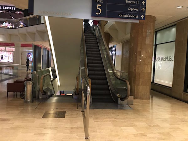
Imagine you want to go to the upper floor, and you are wondering which escalator you should take, you look at the escalators from the direction in this picture:
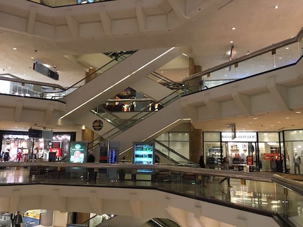
Can you figure out which escalator goes to the upper floor from your floor? From this direction, you can't see the movement of the escalators, you will be at lost
and the only thing you can do is to guess and try your luck.
Esalators exit in 3D world, but in this scenario, people will make judgments in a 2D surface, the information of the movement of the escalators -- a 3D property -- is lost. Thus you can hardly recognize the their directions.
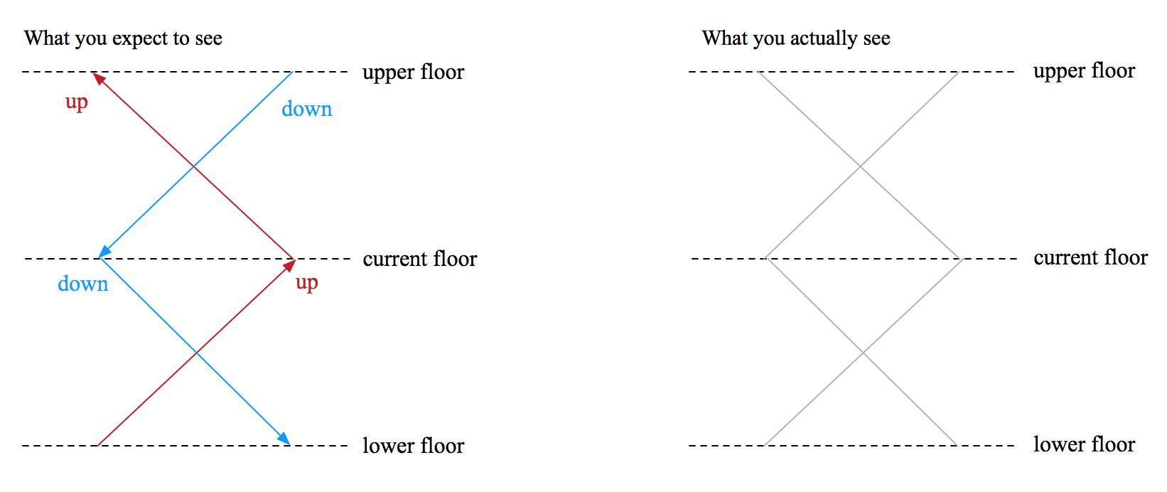
You might wonder if this is the usual case because perhaps you feel you hardly encounter this problem, there is also a reason for this, look at the picture here:

There's actually a social aspect which would help you make decisions, in the picture above, there's a man taking the escalator going up, while you can't see the movement of the escalator,
you could still realize the directions immediately.
2. Two user mental models reveal that most people will not look for the desired escalators(irretional)
Dimension conversion is only a rational reason why people make mistakes in judging the directions of escalators which only applys to a certain type of people, I call them the Judgers.
There's also another type of people who do not even look for cues to judge the correct escalator before they start out. I drew out a sequential diagram for both of the users after my observations.
The Movers' Sequential Diagram:
 The Judgers' Sequential Diagram:

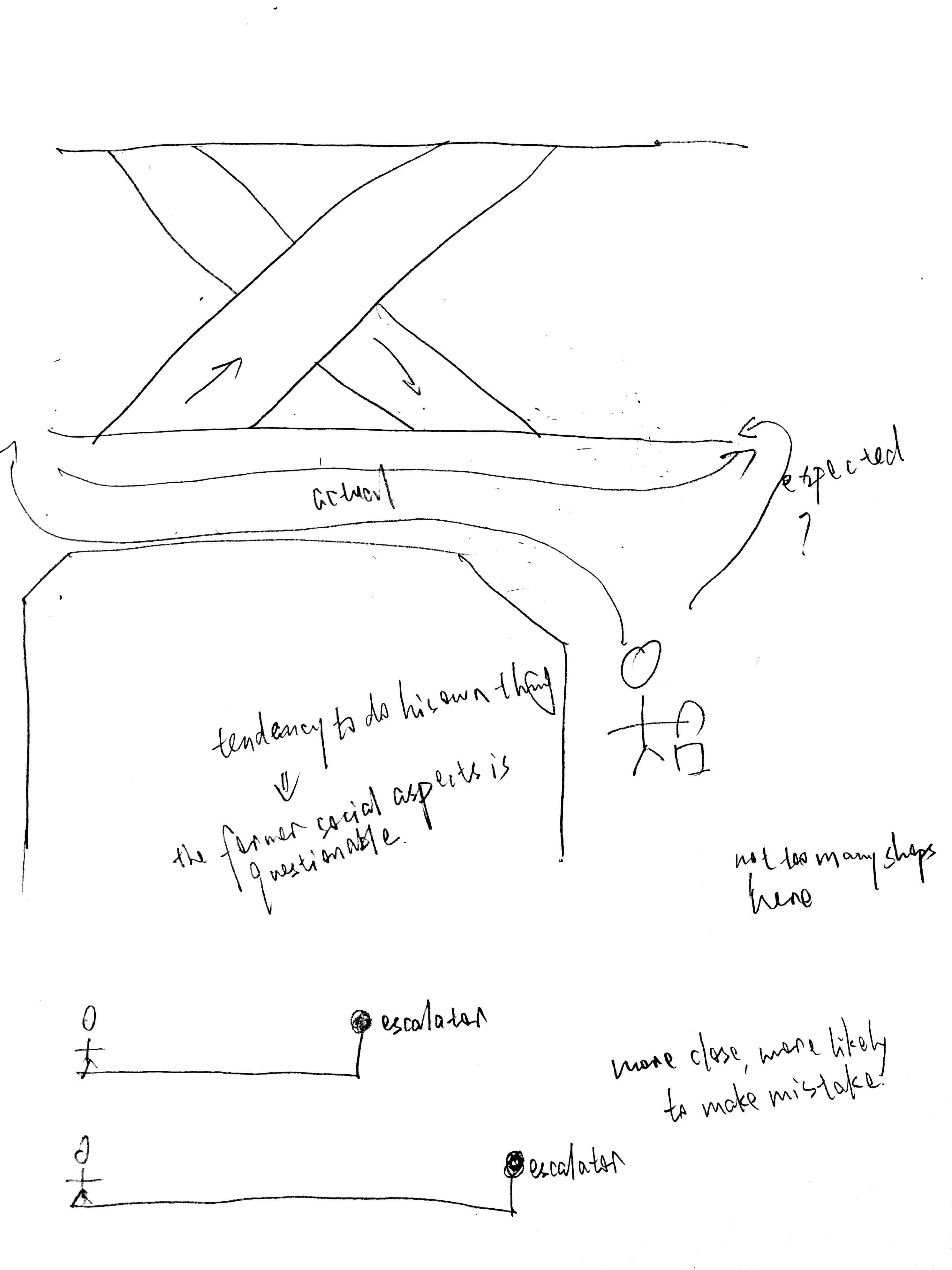
The two mental models differ from when the people make a judgment. The first priority of the Movers is to interact with friends, they will not care much about how to choose the escalator.
Even when they know they need go to the next floor, they do not look for cues until they are right at the escalator. The Judgers concern more on interacting with the escalators than interacting with people.
They look for every cue to judge the correct location of their escalators.
It's true that people who go to malls alone are probably in the Judger mode when choosing escalators, but even among those who are with friends,
there will probably be someone who act as a Judger when others being Movers.
The two mental models show clearly that some potential design solutions, such as giving indicators to show the escalators' directions, will not
be useful at all for Movers, because they will simply ignore them until they make mistakes.
3. The design of building do affect people's judgments on escalators
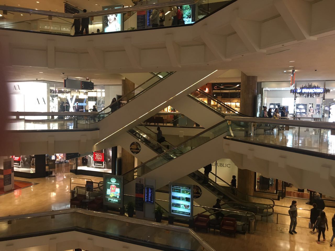
The pictures below are taken from the 2nd floor and 3rd floor in Water Tower Place. On which floor do you think it's easier to choose the correct escalator if you want to go to the upper floor?
Definitely, the second picture, which is the 3rd floor.
Looking from this direction, you can hardly see the 2nd floor's going-down escalator, and part of the 2nd's floor's going-up escalator has been blocked by the 3rd floor's going-down escalator. But in 3rd floor, more cues are presented for you make judgments.
That said, I haven't studied how this factor actually works. I'll do more research on it.
The Design
Each floor is connected with four escalators: from lower floor to this floor, from this floor to upper floor, from upper floor to this floor, and from this floor to lower floor.

As demonstrated above, if a user is now at floor A, he could only use two escalators : A-B and A-C, the green arrows. Combining the three reasons, the problem of recognizing the correct direction can be further explained as: Are there any ways to eliminate or minimize the impact of dimension conversion, social property and misposition of escalators so that users can easily identify the two escalators which are going from his floor to other floors.
The main idea of the solution to this problem is to provide as much cues as possible for users to find out the directions. Instead of only depending on the movement of the escalators, customers could use many other things as cues, such as colors, arrows, lights, etc. The cue should be efficient enough so that customers can notice it without looking for it proactively, customers should also be able to see the cue from anywhere on the floor.
In this project, I mainly explored using colors are the cues, I made a floor model of Water Tower Place.
Original Model:

Solution Model:

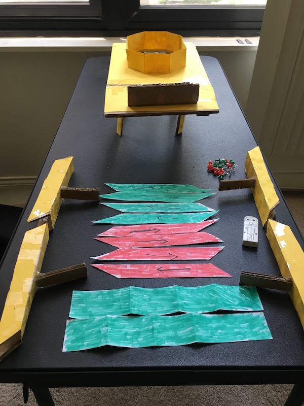
The original model consists of fences, floor, and escalators. They are in same color, and the only cue is the arrow drawn inside the escalators.
In the solution model, I colored some paper to green and red, then pinned the green paper to the two desired escalators, and pinned the red paper to other two escalators. In order to make the cue more recognizable for customers, also made the fences green. Through this way, I hope customers could relate the green color to "the escalators going from this floor" and understand what the colors mean.
I tested two participants with this model. Detailed results are in the final report. I admit that my subjects seemed dissatisfied with the prototype, and I think this is mainly because I didn't come up with a better way to present the cues. It might also be better to make the prototype in a larger size or in the real environment, using colors alone is also difficult to tell them the directions because they still needed to figure out what it meant by each color.
In future work, I want to change cues to explore other potential solutions, and combine different cues together to make it more intuitive, for example, use lights of different colors to show the directions. Another important thing is to study how to organize and present these cues so that customers won't be confused and distracted by them, ideally these cues could also make the overall shopping enviornment more convenient.
Report: Design Plan
Report: Prototype and Final Report

